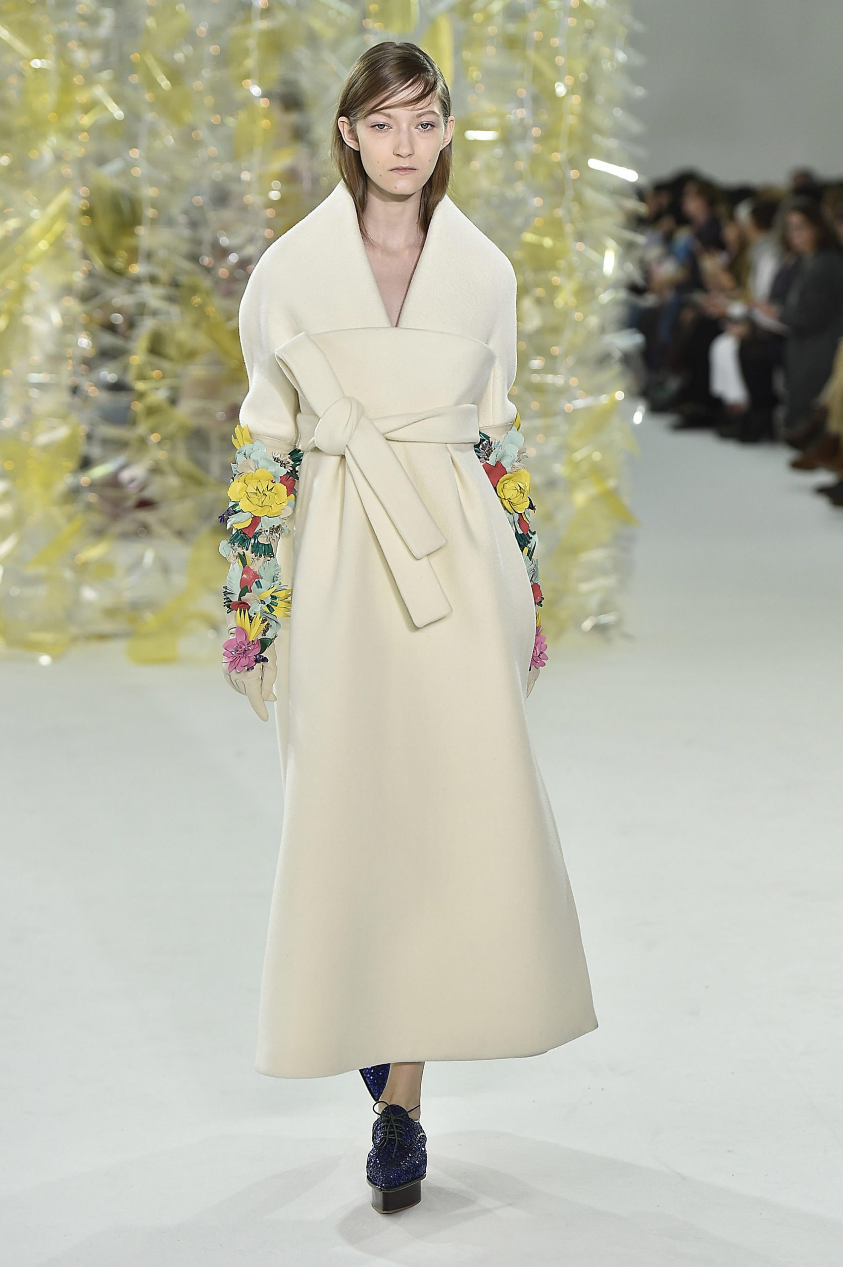
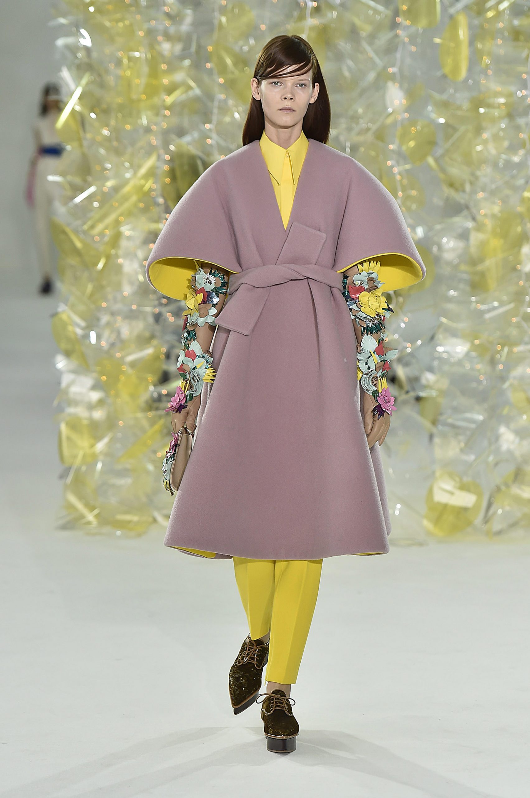
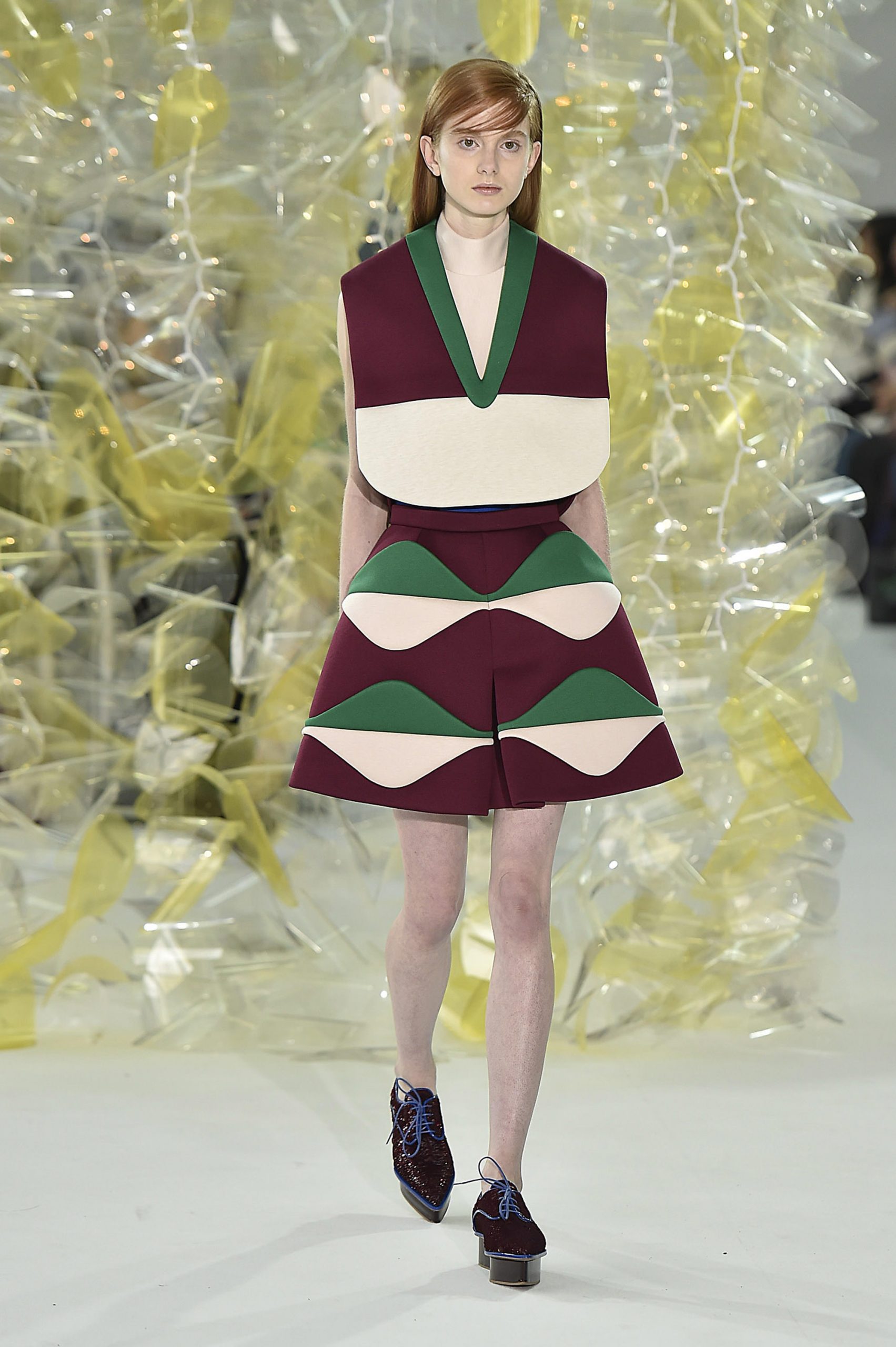
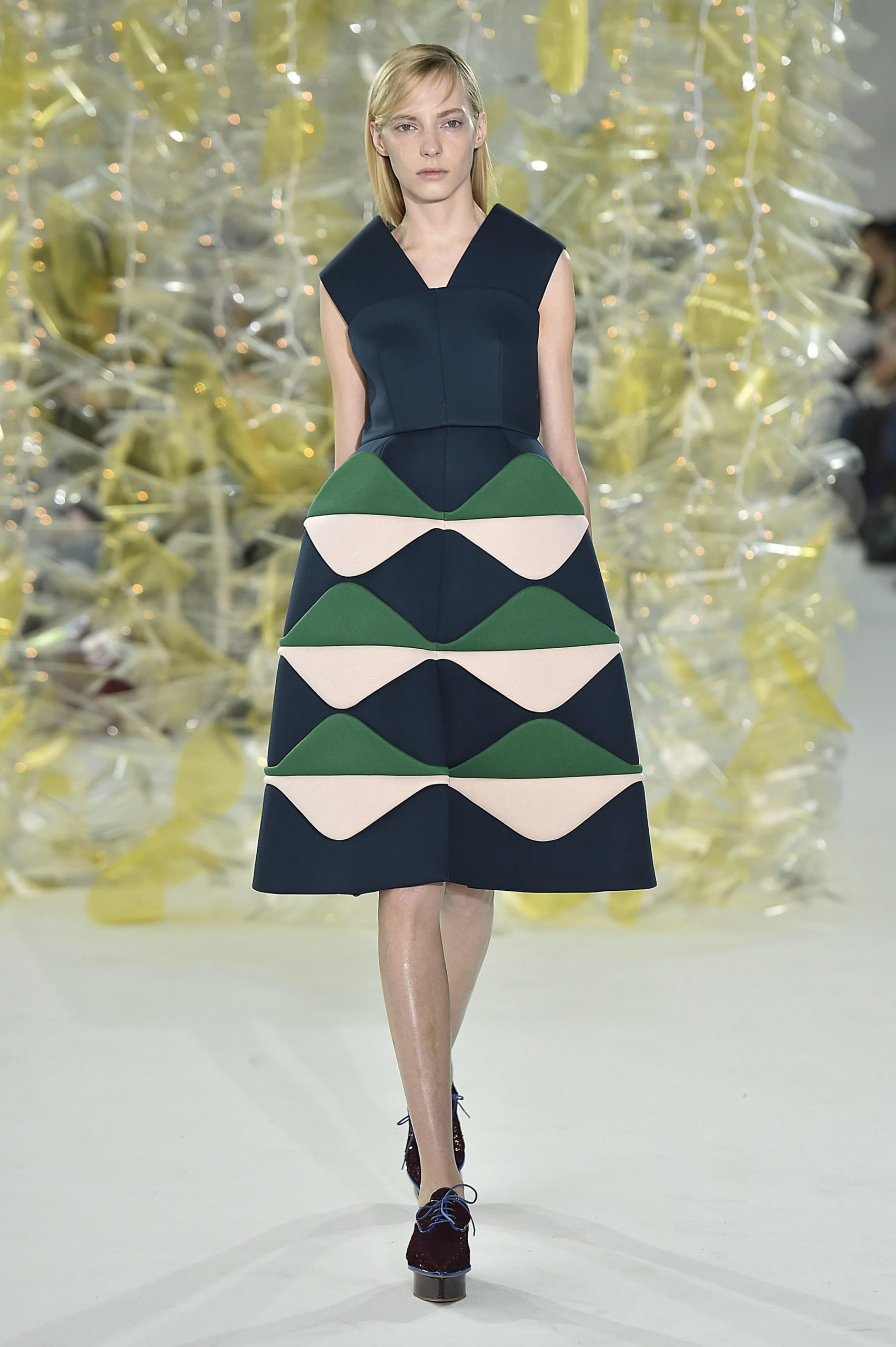
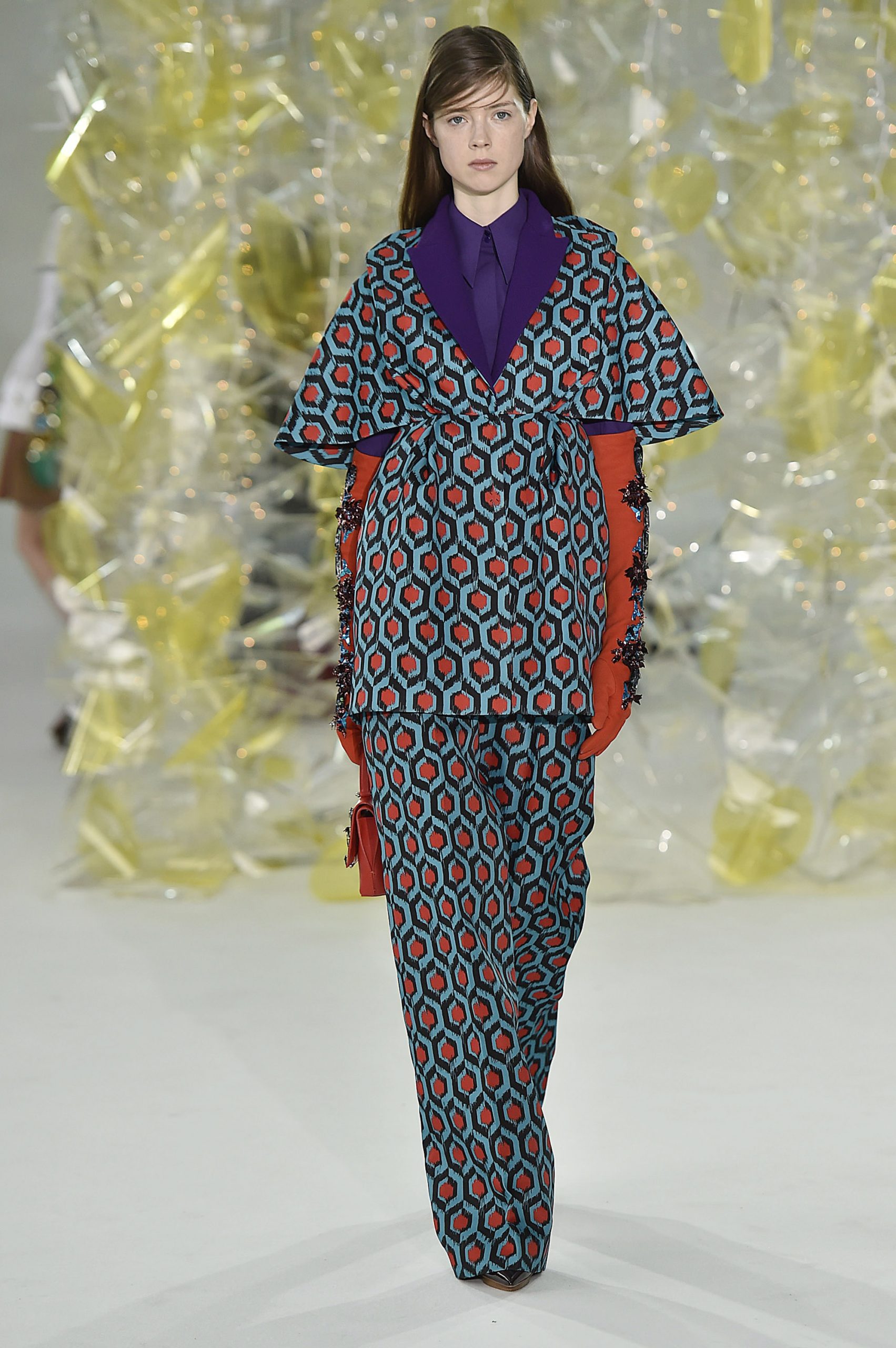
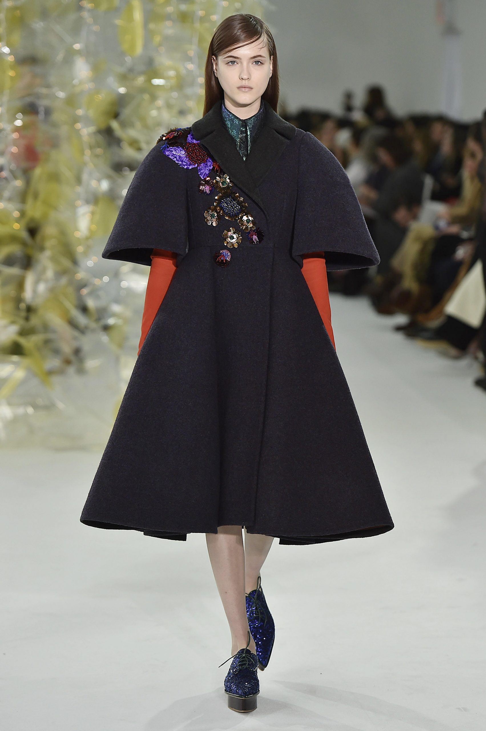
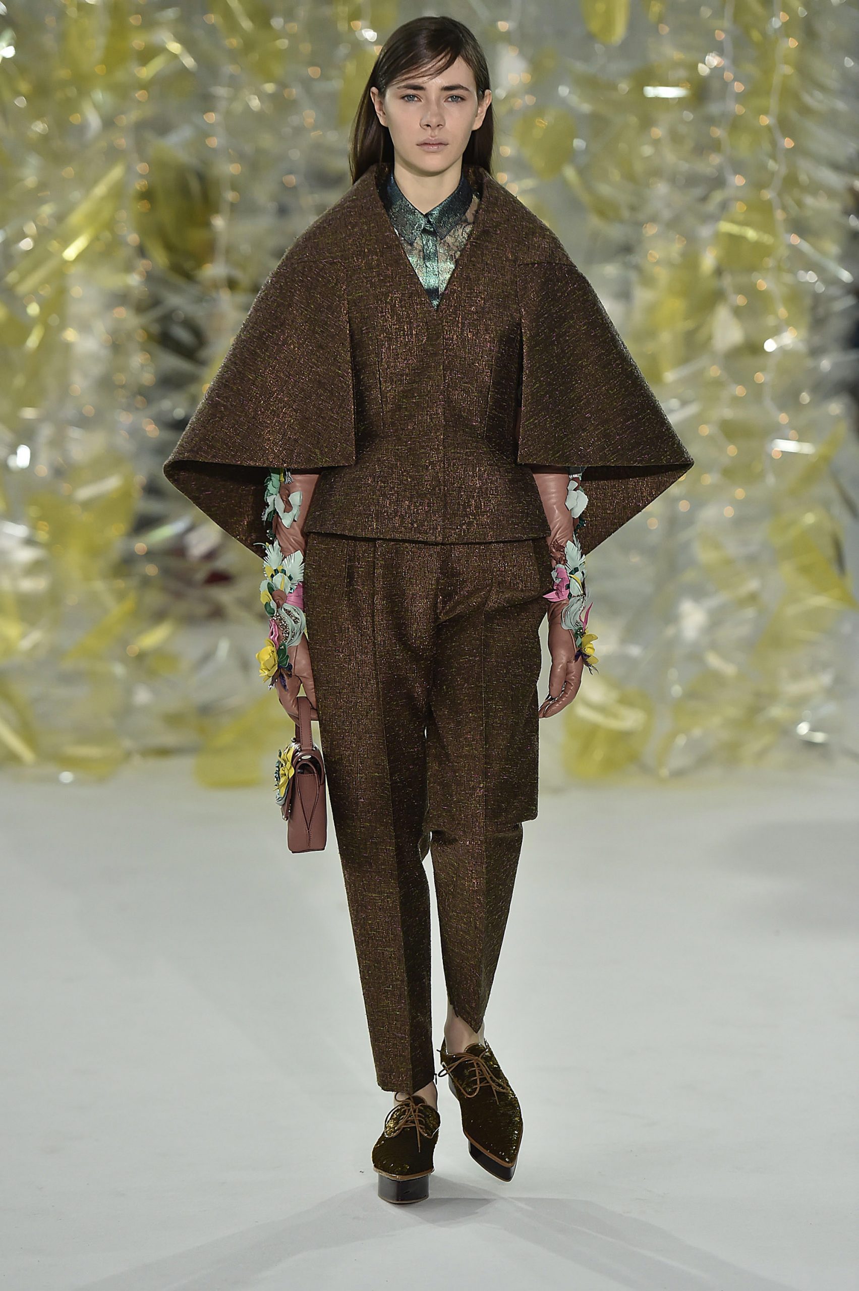
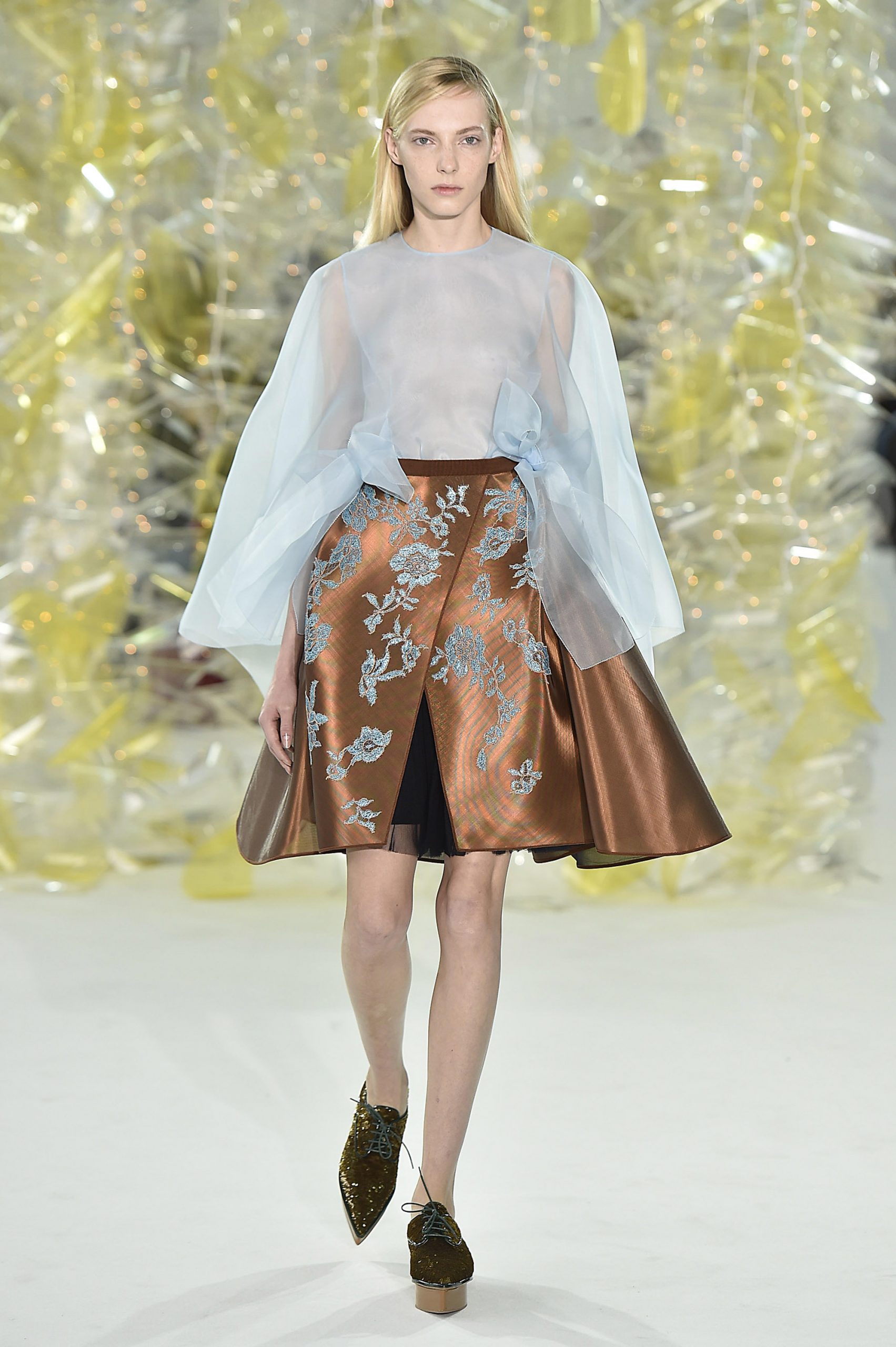
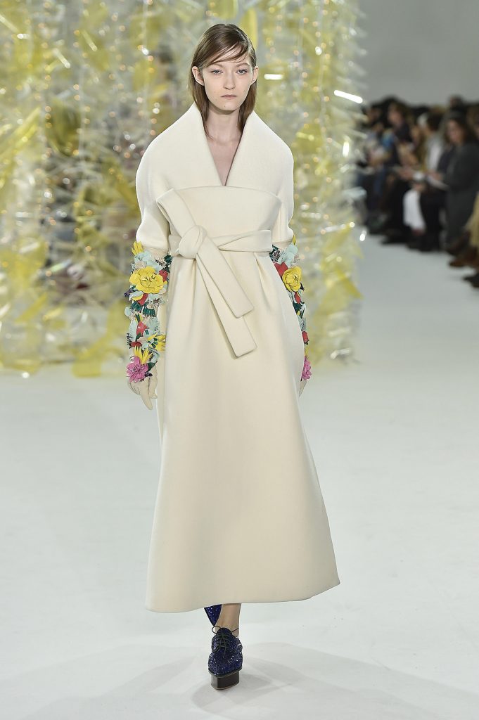
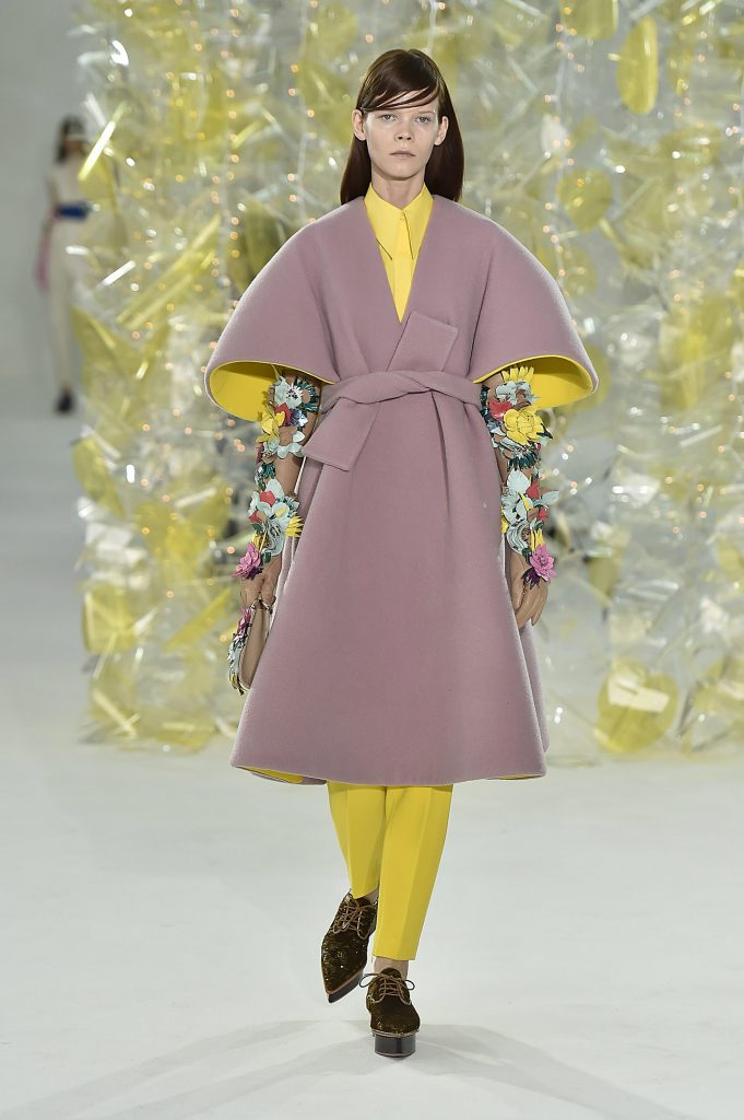
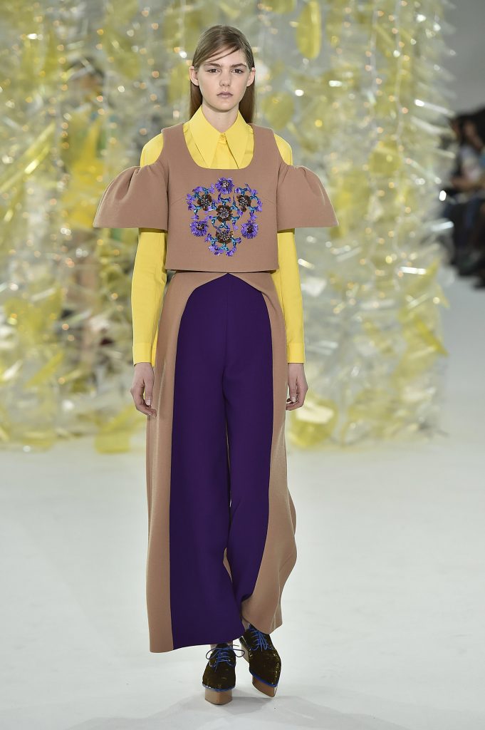
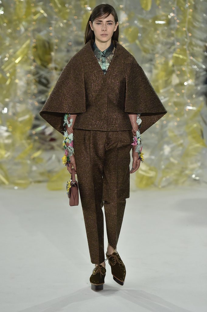
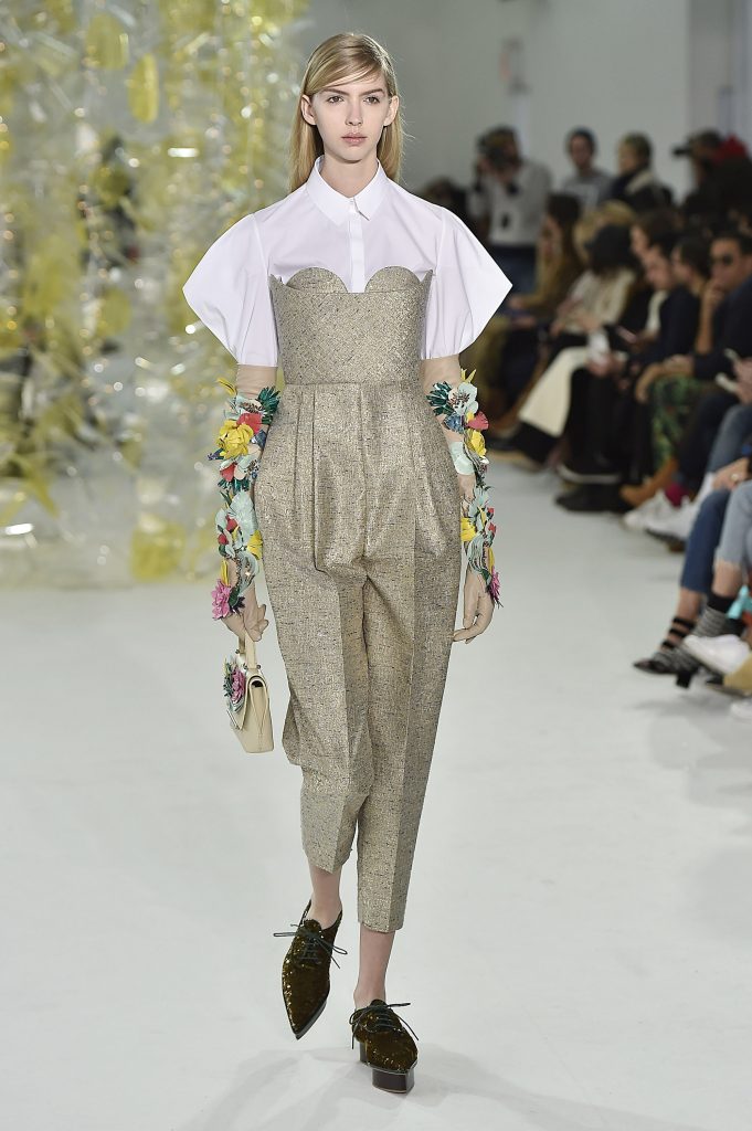
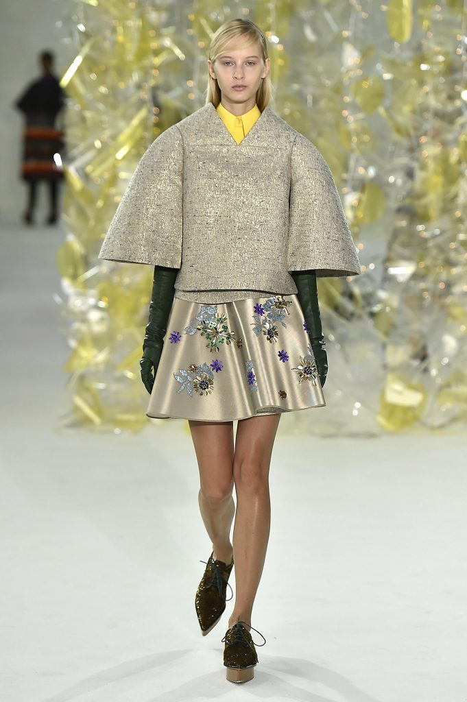
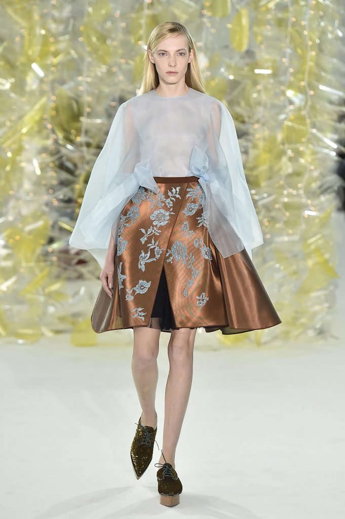
Joeph Font took us on a magical journey through graphic greatness. I love how the show started with a very Asian inspired kimono style jacket with an oversized OBI belted waist. The next garment morphed into a more exaggerated version of the predecessor. Each outfit throughout the collection evolved into the next. Many of the outfits were accessorized with opera length gloves, just blooming with flowers. They emerged out of the hyper-wide sleeves, providing a delicacy to the otherwise more structured lines. The whimsically structured silhouettes definitely lend themselves to being very architectural. Since the Creative Director of Delpozo, Josep Font was trained in Architecture, it is easy to see these elements and three dimensionality in the overly exaggerated shoulders, arms, skirts, and molded silhouettes, which were structurally stupendous and dramatically divine. A few of the garments had graphic inserts of colors, which were evocative of the Matisse’s cutouts. The graphic patterns and inserts in just the right colors created dimension. There is a huge Asian influence seen in this collection. It is sprinkled through the show in various silhouettes. Josep Font experiments with different arm lengths and widths all echoing back to the Kimono. As the show moved on the more structured garments flowed into more billowing garments and then back to more structured garments. The tongue-in-cheek circular inserts popping out of the bustiers as though you were seeing a bit of the breast, (which was actually covered), was a fun and interesting detail.
